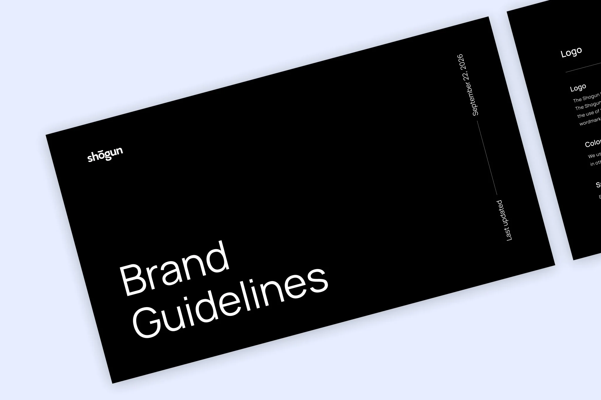
Shogun Brand Refresh
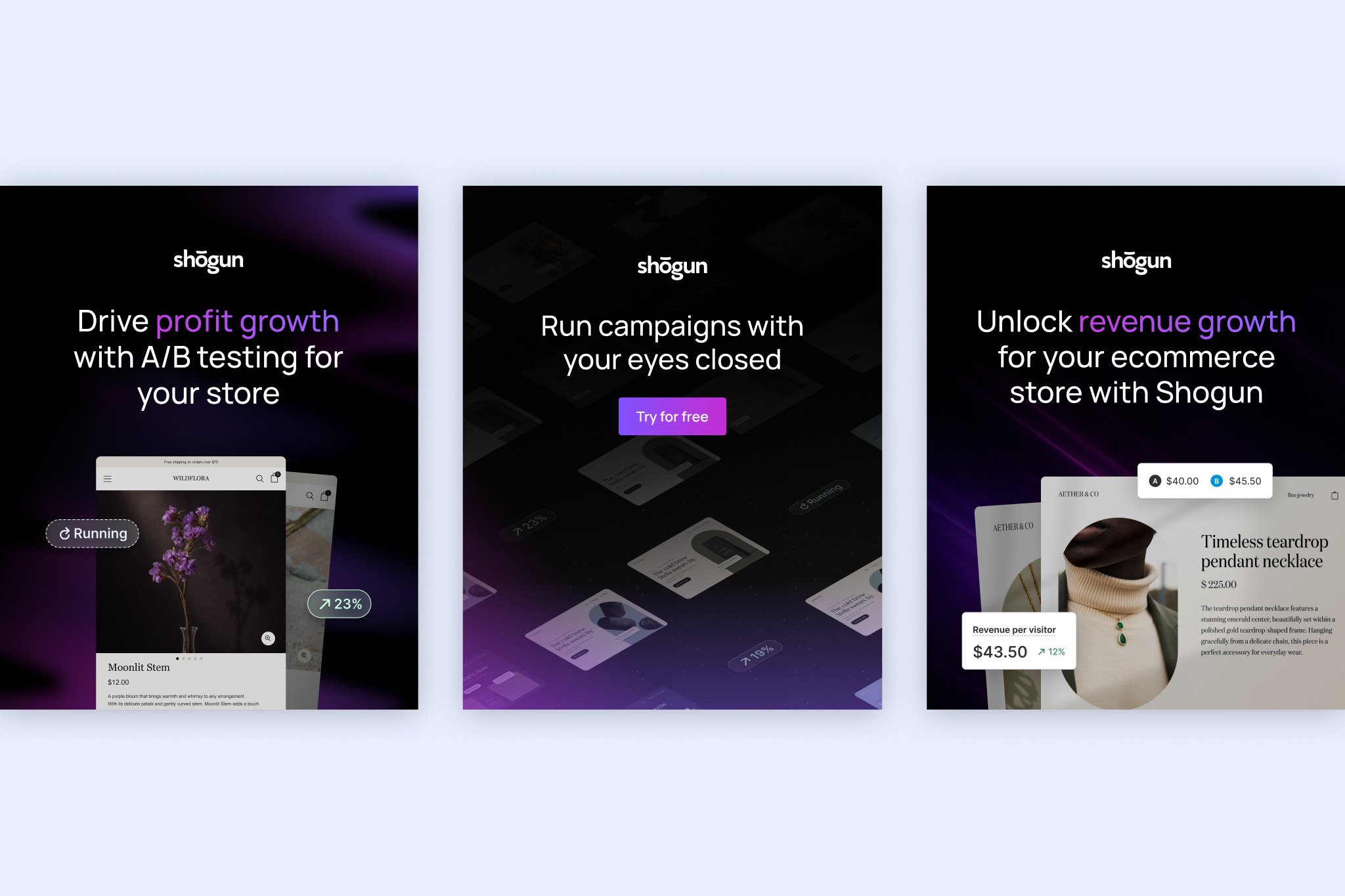
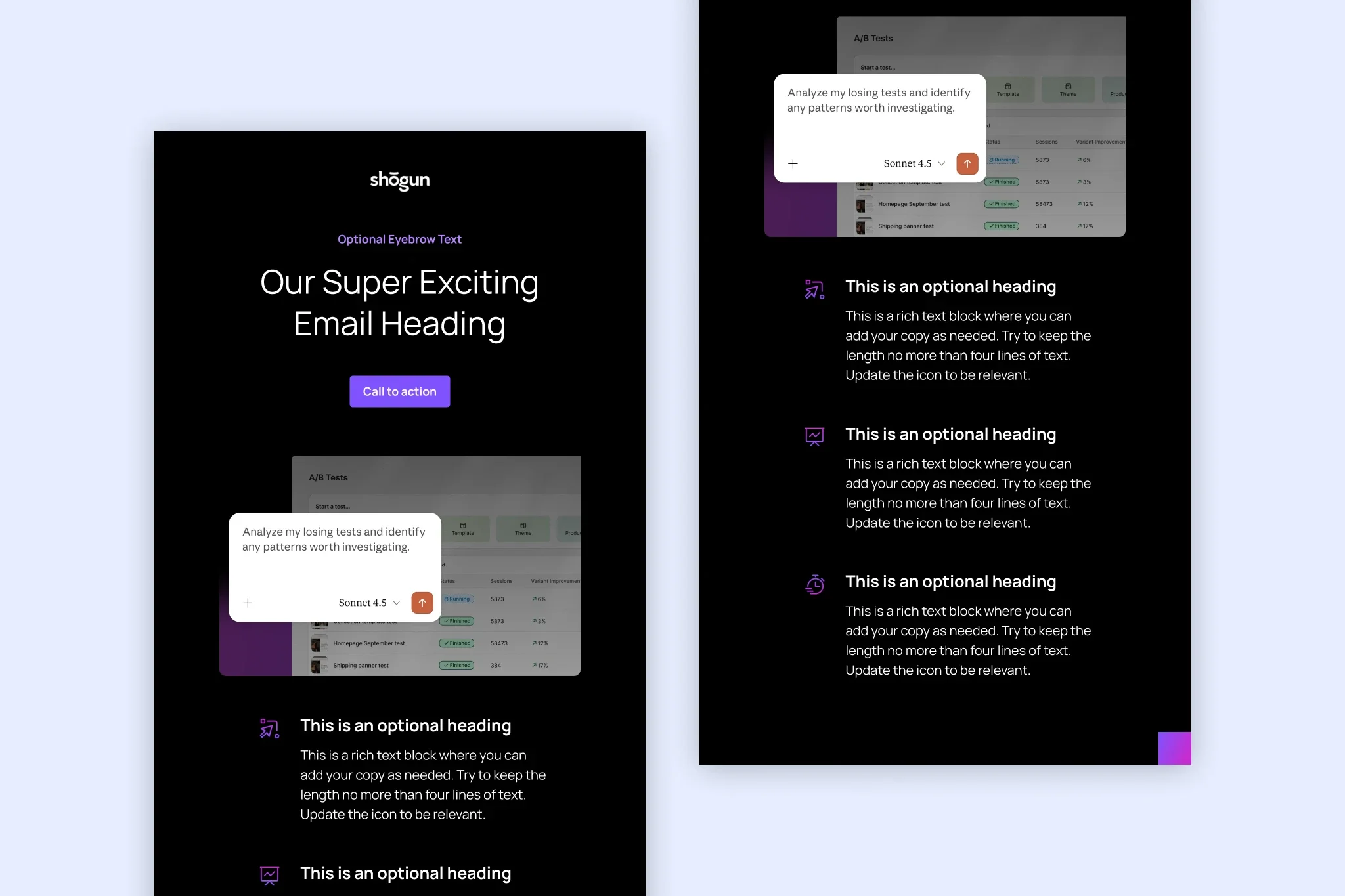
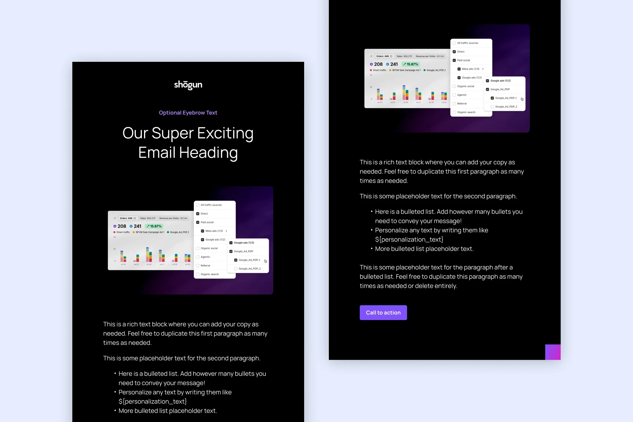
As Shogun evolved into a more CRO-focused solution, I was tasked with elevating the brand’s look and feel. The goal was to create a more confident, sophisticated identity and bring the marketing closer to the product by showcasing real product UI.
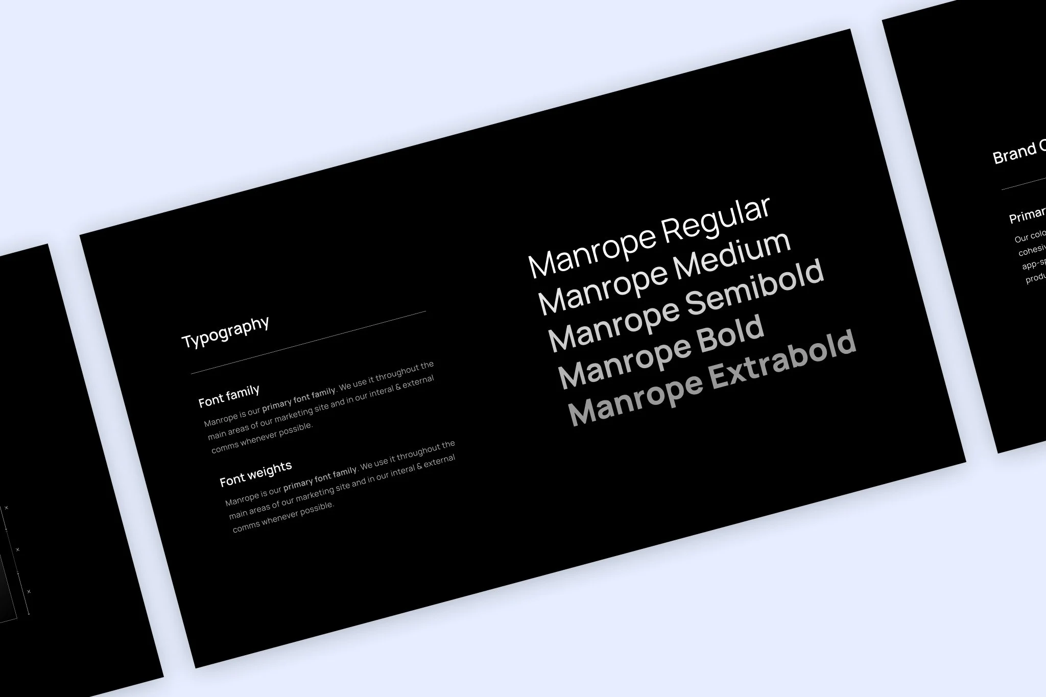
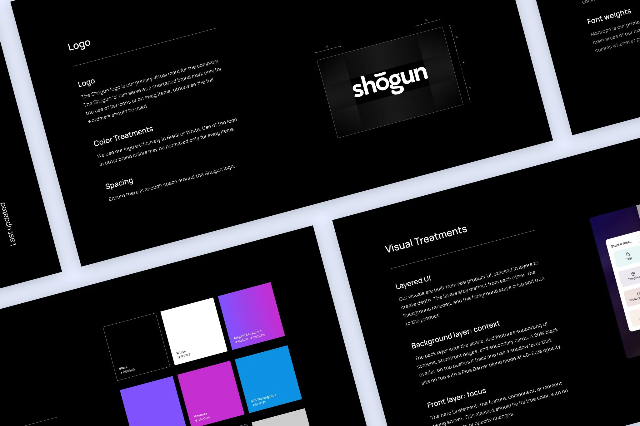
I refined the visual foundation by replacing Söhne with Manrope, a thinner, more angular typeface, and shifting the primary background color from a charcoal tone to a rich, true black. A new gradient inspired by the in-app experience further connected the marketing presence to the product.
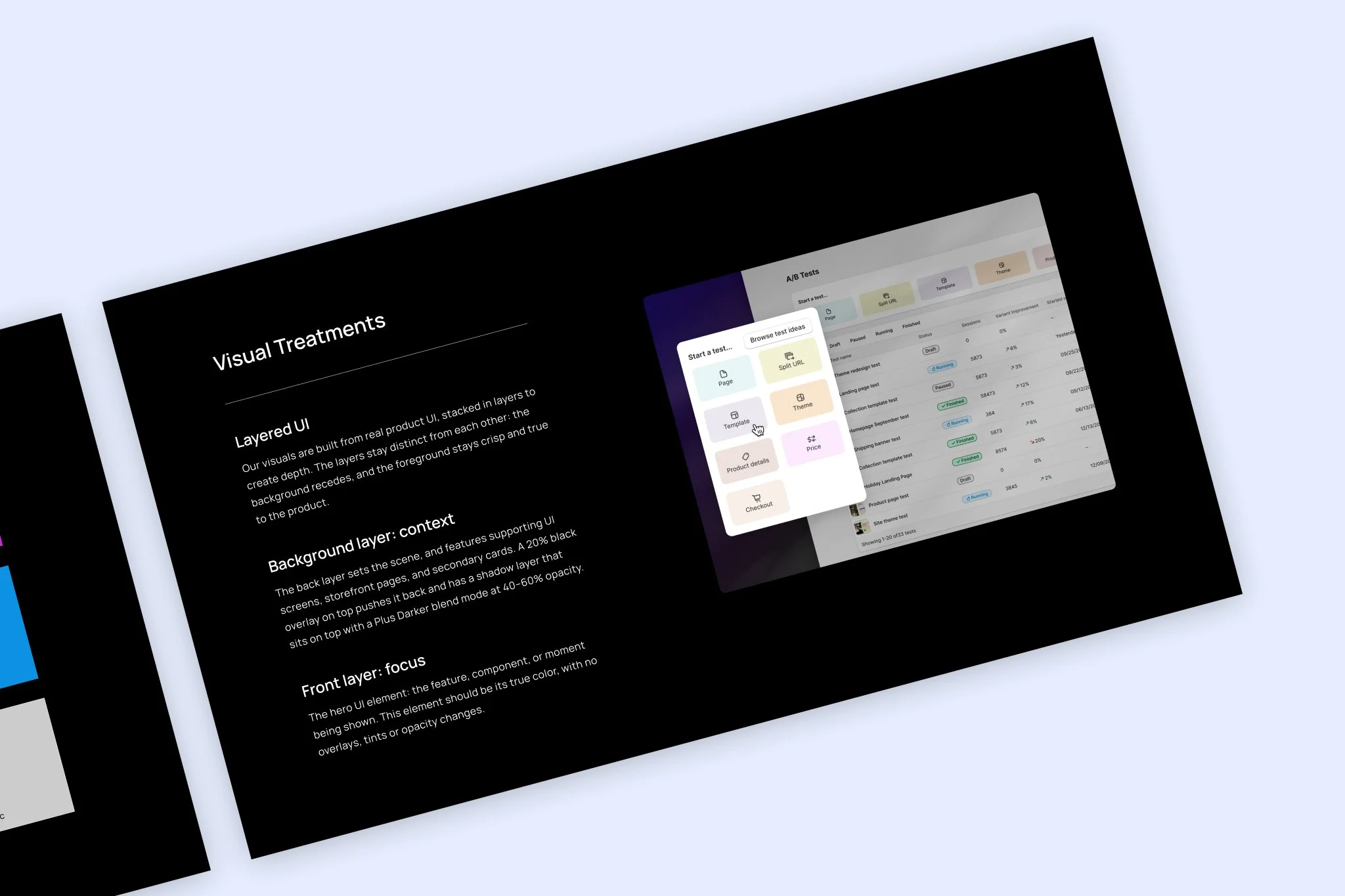
I also developed a visual treatment built around layers of real product UI. Background screens, storefronts, and supporting cards use dark overlays and shadows to create depth, while the foreground stays crisp and true to the original interface. This creates visual interest and a clear focal point for highlighting specific UI elements and product features.
For
Shogun
Year
2026